


- Introduction
- Function Introduction
- Performance Monitor
- Fusion Hunter
- Quantitative Chart
- SEC Filing
- Insider Trading (Search by Ticker)
- Insider Trading (Search by Reporter)
- Insider Trading (Top Insider Trading)
- Institutional Holdings
- Investment Trends (Investment Company List)
- Investment Trends (Sector & Industry Sentiment)
- Investment Trends (Investment Company Sentiment)
- Investment Trends (Top Institutional Trading)
- Investment Trends (Top Institutional Hldg Change)
- Key Ratio Distribution
- Screener
- Financial Statement
- Key Metrics
- High Current Difference
- Low Current Difference
- Relative Strength Index
- KDJ
- Bollinger Bands
- Price Earnings Ratio
- Price to Book Value
- Debt Equity Ratio
- Leverage Ratio
- Return on Equity
- Return on Assets
- Gross Margin
- Net Profit Margin
- Operating Margin
- Income Growth
- Sales Growth
- Quick Ratio
- Current Ratio
- Interest Coverage
- Institutional Ownership
- Sector & Industry Classification
- Data Portal
- API
- SEC Forms
- Form 4
- Form 3
- Form 5
- CT ORDER
- Form 13F
- Form SC 13D
- Form SC 14D9
- Form SC 13G
- Form SC 13E1
- Form SC 13E3
- Form SC TO
- Form S-3D
- Form S-1
- Form F-1
- Form 8-k
- Form 1-E
- Form 144
- Form 20-F
- Form ARS
- Form 6-K
- Form 10-K
- Form 10-Q
- Form 10-KT
- Form 10-QT
- Form 11-K
- Form DEF 14A
- Form 10-D
- Form 13H
- Form 24F-2
- Form 15
- Form 25
- Form 40-F
- Form 424
- Form 425
- Form 8-A
- Form 8-M
- Form ADV-E
- Form ANNLRPT
- Form APP WD
- Form AW
- Form CB
- Form CORRESP
- Form DSTRBRPT
- Form EFFECT
- Form F-10
- Form F-3
- Form F-4
- Form F-6
- Form F-7
- Form F-9
- Form F-n
- Form X-17A-5
- Form F-X
- Form FWP
- Form G-405
- Form G-FIN
- Form MSD
- Form N-14
- Form N-18F1
- Form N-18F1
- Form N-30B-2
- Form N-54A
- Form N-8A
- Form N-CSR
- Form N-MFP
- Form N-PX
- Form N-Q
- Form TTW
- Form TA-1
- Form T-3
- Form SC 14F1
- Form SE
- Form SP 15D2
- Form SUPPL
- Form 10-12G
- Form 18-K
- Form SD
- Form STOP ORDER
- Form TH
- Form 1
- Form 19B-4(e)
- Form 40-APP
- Form 497
- Form ABS-15G
- Form DRS
- Form MA
- Form UNDER
- AI sentiment
- Access guide
- Academy
- Term of service
- GDPR compliance
- Contact Us
- Question Center
| Font Size: |
Price Earnings Ratio
Price earnings ratio (PE) measures how much dollar amount investors need to pay in order to get one dollar return. It is calculated through dividing market price by 12 months trailing earnings per share presented in statement of operation. While high PE may represent high expectation of investors on a company's earning potential, generally low PE (if not negative) is preferred. Research shows significant negative correlation between PE and subsequent return (Figure 1). After adjusting for consumer price index of corresponding period, PE is widely used by economists to evaluate bubbles on the market. PE has sector and industry specific distributions. For example, technology sector usually has higher PE than the market average. It is thus not quite meaningful to directly compare PE of companies from different sector/industry. However, it is meaningful to compare their performance relative to industry/sector peers.
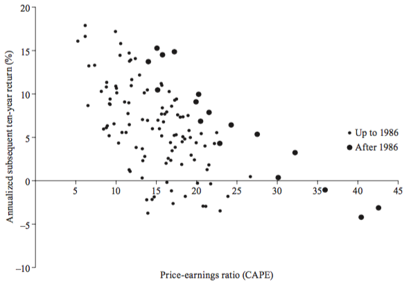
Figure 1: Scatter diagram of annualized ten-year returns against price-earnings ratios. Horizontal axis shows the CAPE (cyclically adjusted price-earning ratio) for January of the year. Vertical axis shows the geometric average real annual return per year on investing in the S&P Composite Index in January of the year shown, reinvesting dividends, and selling ten years later. [Irrational Exuberance, Robert J. Shiller]
PE could be a negative number if the earnings is negative (i.e. the company is losing money). Practitioners and academics typically omit such stocks since a negative PE has no obvious interpretation. Surprisingly, the number (and proportion) of stocks that reported negative earnings is often non-trivial (~25% as of May 2017 on the whole US market. Even higher (~54%) in the energy sector). As such the "if negative then remove" practice causes a significant proprotion of stocks to be dropped from analysis. We noticed that for each dollar of investment, when PE is negative (the negative side), more loss results in larger PE (closer to 0). When PE is positive (the positive side), more profits result in smaller PE (closer to 0). There is a tipping point at 0, where PE slightly above 0 is extremely good (theoretically), and PE slightly below 0 is extremely bad. To make a continuous ranking of PE possible on both positive and negative side, the performance monitor use 1/PE to generate quantile ranking. 1/PE represents "how much gain/loss an investor can get by investing 1 dollar". A high quantile ranking represents a high 1/PE (good performance) and vice versa, regardless of whether the earnings is negative or not.
Example 1: Google Inc. (NASDAQ:GOOG) has PE of 33.56 as the end of Dec 31th 2015. At the same time, Apple Inc. (NASDAQ:AAPL) has PE of 11.42
|
GOOG Price Earnings Ratio: 33.56
|
AAPL Price Earnings Ratio: 11.42
|
The PE of GOOG is better than (lower than) 74% of industry peers, and 63% of sector peers. However, it is better than less than half (46%) of other stocks on the whole market.
The PE of AAPL is better (lower) than GOOG. However, from an industrial perspective, AAPL and GOOG have quite similar performance (74% and 77% respectively). From sector perspective and the whole market perspective, the PE of AAPL is better (lower) than GOOG.
Another observation is that "Technology" sector, and "Computer Software: Programming, Data Processing" industry (where GOOG belongs to) have overall higher (poorer) price earnings ratio than the whole market.
PE distribution
The figures below show the distributions of PE on the whole market and in technology sector as of 2016-01-01 (solid blue line) and one year ago (dashed pink line), as well as the location of AAPL and GOOG. Note the left shift of PE in the positive part of x-axis, and a higher peak in negative PE, which stands for poor market outlook and poor earnings performance compared with one year ago. At both market and sector level, AAPL has PE lower(better) than GOOG. The PE of AAPL is located on the left of the peak, indicating it is better than majority of sector peers.
Whole Market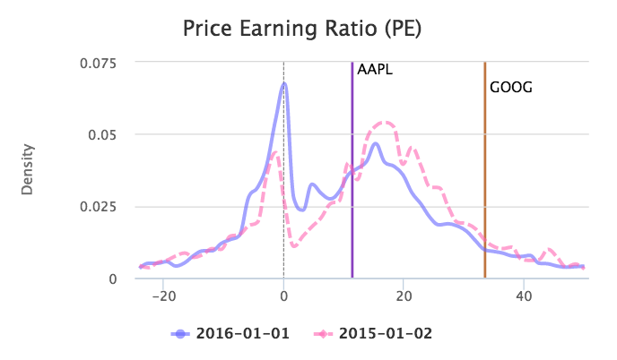
|
Technology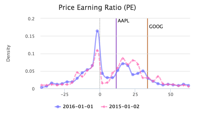
|
Historical Data
The figures below show the PE history of AAPL and GOOG between 2015 Jan and 2017 Jan. The lines indicate different trend of PE change of the two companies. Generally, AAPL has decreasing PE from start of 2015 to start of 2016, and increasing PE performance relative to the whole market during this period (the decrease in AAPL PE is attributable to decrease in market price and increase in earnings during this period, reflecting investors concern about the future earnings potential of AAPL). The PE of GOOG shows reverse trend compared with AAPL.
Price Earnings Ratio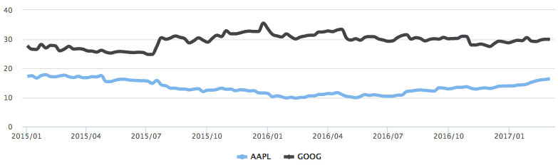
|
Industry performance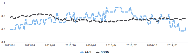
|
Sector performance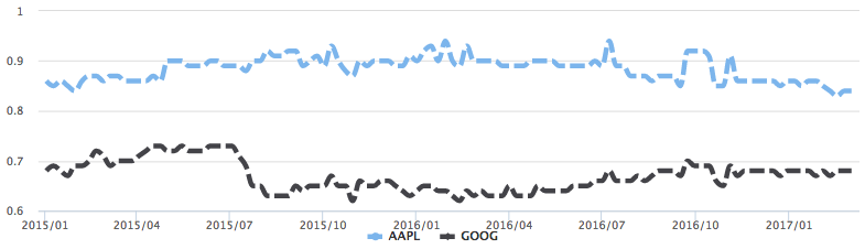
|
Market performance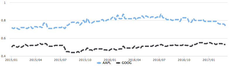
|
It is not recommended to judge the investment value of a stock by purely looking at PE, in a similar way as by purely looking at the price itself. However, by comparing PE between peers, and across different time period, it is always possible to tell whether the bubble (as reflected by PE) is increasing, or decreasing.
Price to Operating Income
The calculation of price to operating income (POE) is similar to PE, by replacing the denominator from earnings per share to operating income per share. Operating income is the earnings of a company without considering non-operating income (i.e. gains or losses from sources not related to the typical activities of the business. Such as stock investment, one time payment for penalty) and before paying tax and interest expenses. Operating income is considered a more stable source of income, and reflects more about the operational efficiency of the management team.
Price to Sales Ratio
The calculation of price to sales ratio is similar to PE, by replacing the denominator from earnings per share to revenue per share. Price to sales ratio is primarily used as a surrogate of PE when a company has negative earnings. Generally low price to sales ratio is preferred, which represents less investment for each unit of sales. Price to sales ratios vary widely across industries. So it only makes sense to compare price to sales ratios between companies within the same industry.