


- Introduction
- Function Introduction
- Performance Monitor
- Fusion Hunter
- Quantitative Chart
- SEC Filing
- Insider Trading (Search by Ticker)
- Insider Trading (Search by Reporter)
- Insider Trading (Top Insider Trading)
- Institutional Holdings
- Investment Trends (Investment Company List)
- Investment Trends (Sector & Industry Sentiment)
- Investment Trends (Investment Company Sentiment)
- Investment Trends (Top Institutional Trading)
- Investment Trends (Top Institutional Hldg Change)
- Key Ratio Distribution
- Screener
- Financial Statement
- Key Metrics
- High Current Difference
- Low Current Difference
- Relative Strength Index
- KDJ
- Bollinger Bands
- Price Earnings Ratio
- Price to Book Value
- Debt Equity Ratio
- Leverage Ratio
- Return on Equity
- Return on Assets
- Gross Margin
- Net Profit Margin
- Operating Margin
- Income Growth
- Sales Growth
- Quick Ratio
- Current Ratio
- Interest Coverage
- Institutional Ownership
- Sector & Industry Classification
- Data Portal
- API
- SEC Forms
- Form 4
- Form 3
- Form 5
- CT ORDER
- Form 13F
- Form SC 13D
- Form SC 14D9
- Form SC 13G
- Form SC 13E1
- Form SC 13E3
- Form SC TO
- Form S-3D
- Form S-1
- Form F-1
- Form 8-k
- Form 1-E
- Form 144
- Form 20-F
- Form ARS
- Form 6-K
- Form 10-K
- Form 10-Q
- Form 10-KT
- Form 10-QT
- Form 11-K
- Form DEF 14A
- Form 10-D
- Form 13H
- Form 24F-2
- Form 15
- Form 25
- Form 40-F
- Form 424
- Form 425
- Form 8-A
- Form 8-M
- Form ADV-E
- Form ANNLRPT
- Form APP WD
- Form AW
- Form CB
- Form CORRESP
- Form DSTRBRPT
- Form EFFECT
- Form F-10
- Form F-3
- Form F-4
- Form F-6
- Form F-7
- Form F-9
- Form F-n
- Form X-17A-5
- Form F-X
- Form FWP
- Form G-405
- Form G-FIN
- Form MSD
- Form N-14
- Form N-18F1
- Form N-18F1
- Form N-30B-2
- Form N-54A
- Form N-8A
- Form N-CSR
- Form N-MFP
- Form N-PX
- Form N-Q
- Form TTW
- Form TA-1
- Form T-3
- Form SC 14F1
- Form SE
- Form SP 15D2
- Form SUPPL
- Form 10-12G
- Form 18-K
- Form SD
- Form STOP ORDER
- Form TH
- Form 1
- Form 19B-4(e)
- Form 40-APP
- Form 497
- Form ABS-15G
- Form DRS
- Form MA
- Form UNDER
- AI sentiment
- Access guide
- Academy
- Term of service
- GDPR compliance
- Contact Us
- Question Center
| Font Size: |
Key Ratio Distribution
Key ratio distribution provides the frequency distribution of key financial ratios in more than 100 industries, 13 sectors, as well as on the whole market. By default it provides the most recent distribution profiles, compared with the profiles of one year ago. Other options (available from the options panel) are comparing with one quarter ago, half year ago, two years ago, or the earliest available date (2014) recorded in the database. Colored solid vertical lines which mark the locations of the financial ratio of any selected tickers are displayed simultaneously.
On first load, The distributions will be for whatever sector or industry selected in the options panel, and also displayed the location of any queried tickers if they belong to the selected sector or industry. Users can click the links in "Ticker Information" table to bring up the distribution of whatever sector or industry the ticker belongs to.
Tips: click a point or a series legend on the figure to show single series. Use mouse to select any time span on the figure to zoom in.
Example 1
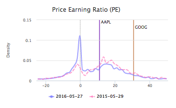
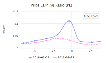
Price earnings ratio (PE ratio) distribution of the whole market as of 2016-05-27 (solid blue) compared to 2015-05-29 (dashed pink), and the most recent PE ratio of Alphabet Inc. (GOOG) and Apple Inc. (AAPL). For the positive part (PE > 0) of the distribution, There is a slight shift to left compared with one year ago, suggesting (at the whole market level) relatively less investment is required to get one dollar return. The dashed black vertical line marks PE equal to 0. To the left of 0 there is a remarkable peak composed of companies with negative earnings, which is much higher than one year ago (see the zoomed figure on the right). This indicates increased proportion of companies with diffculties in making enough money to cover their cost of production. Also note that AAPL has lower PE than GOOG as of 2016-05-27, indicating AAPL has higher return than GOOG for the same amount of money invested.
Example 2
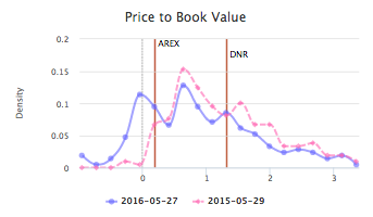
Price to book value distribution and debt equity ratio distribution of the oil & gas production industry as of 2016-05-27 (solid blue), compared with 2015-05-29 (dashed pink), and the most recent corresponding data of Approach Resources Inc. (AREX) and Denbury Resources Inc. (DNR), two Texas based shale oil companies. For the price to book value, compared with one year ago, there is a significant left shift on the positive part, indicating investors expect management to create less profit from given equities. There is also a remarkably higher peak on the negative part, implying increased number of companies in the industry have liabilities exceed assets. According to the figure it is also clear that AREX has lower price to book value than DNR and majority of industry peers as of 2016-05-27.
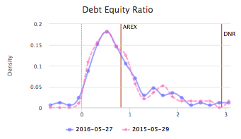
The second figure on the right indicates no obvious change in debt equity ratio distribution of the industry, compared with one year ago. AREX has lower debt burden than DNR, which has almost the highest debt burden in the industry (as of 2015-05-27).